Embark on a captivating journey of discovery with Blend's 'Thought Leadership'. Immerse yourself in great insights from our team members, delving into the vast landscape of data science, AI and technology. Dive into our latest content now and elevate your understanding of the ever-evolving tech frontier.
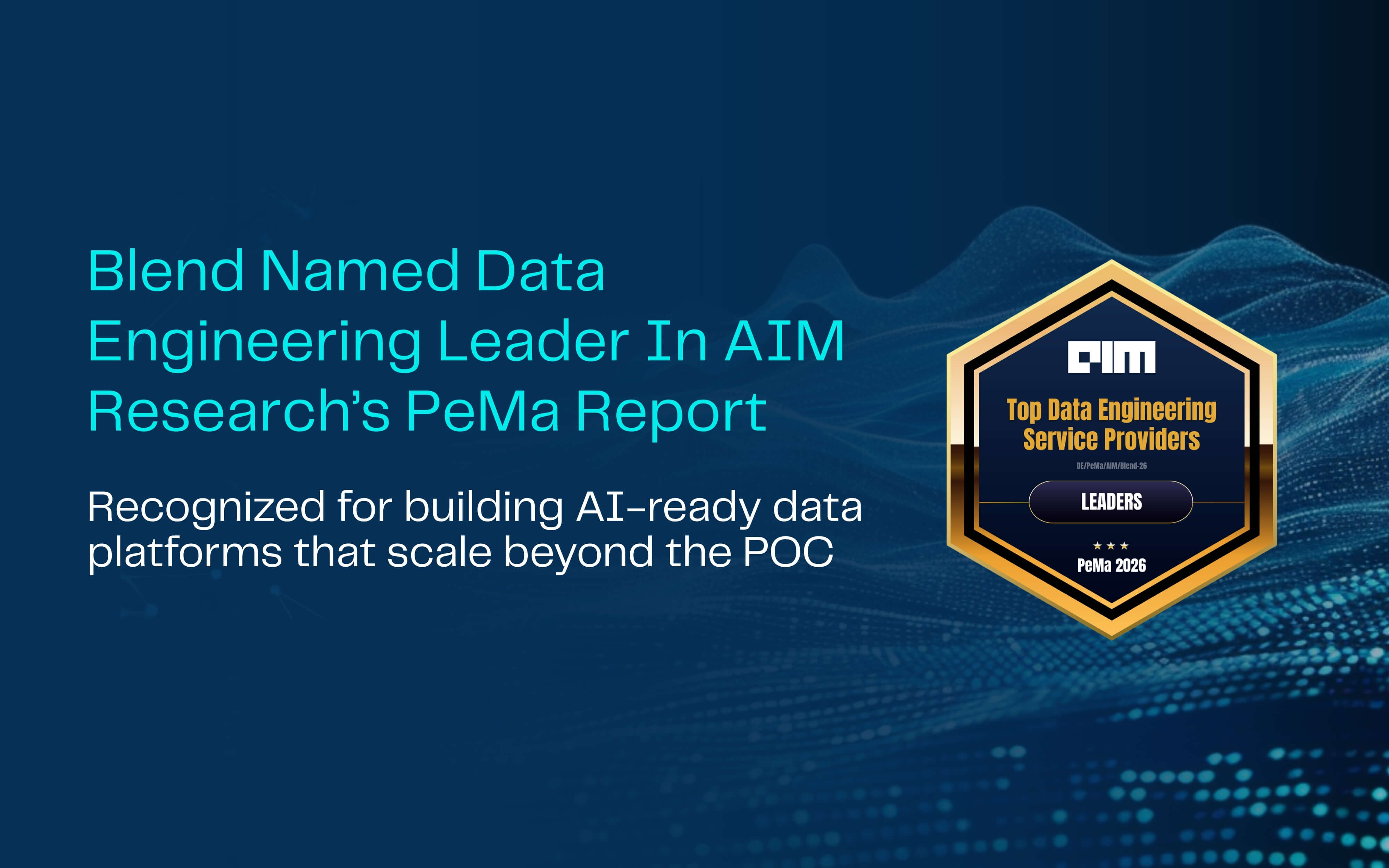
Blend Earns Back-to-Back Leader Recognition in AIM Research's 2026 Data Engineering PeMa Quadrant
%20(1).png)
Blend Achieves 80%+ GenAI Production Rate in AIM Research's 2026 Leaders Quadrant
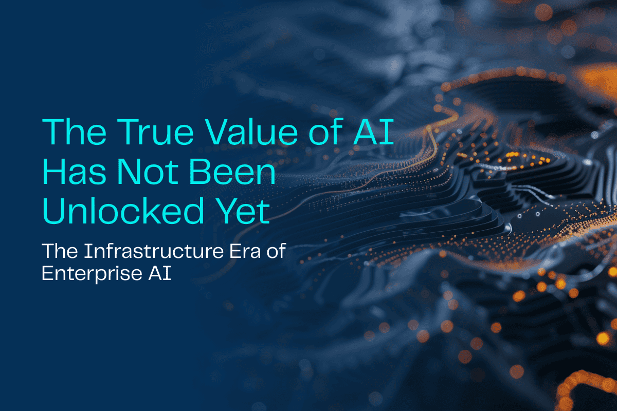
The True Value of AI Has Not Been Unlocked Yet

The Critical Role of AI Orchestration in Modern Enterprises

AI as Biology: Why Thinking Like a Gardener Beats Engineering for Enterprise ROI
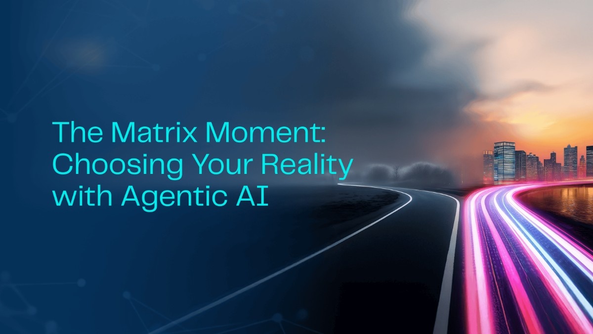
The Matrix Moment: Choosing Your Reality with Agentic AI
.png)
Deep Dive into Unity Catalog: Your Trusted Governance Layer
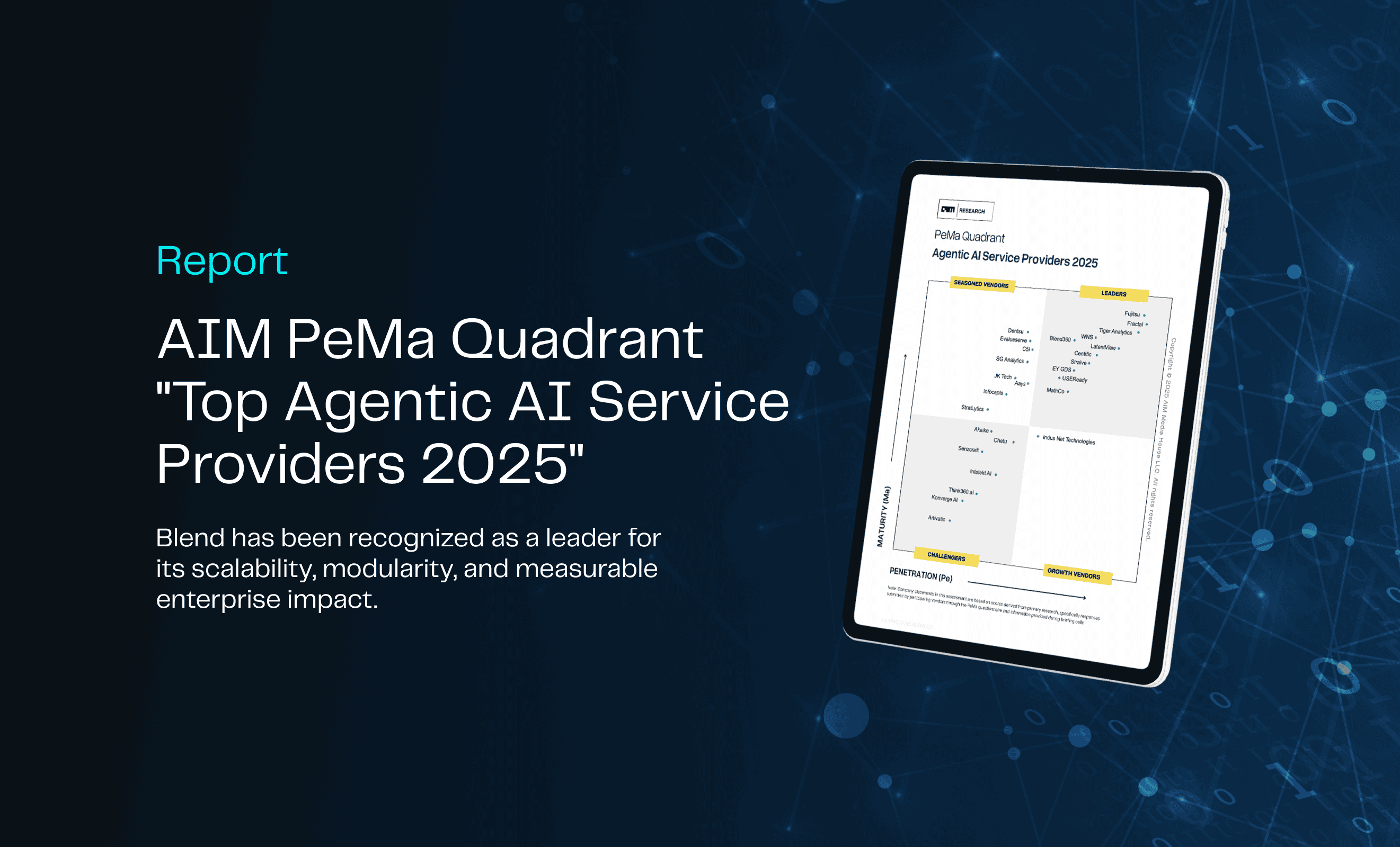
Blend Powers Agentic AI Revolution with 80% Success Rate in AIM Research’s Top Service Providers 2025 Report
%20(1).png)
Beyond Transactions: How AI Is Writing the Future of Payments
The Marketing Revolution I’ve Witnessed: From Predictive Dreams to Generative Reality

From Insight to Impact: Align Your Analytics with Real Business Goals

From Dashboards to Decision Engines: Climbing the Gen BI Maturity Curve

eBook | Bridging the Gap: The Dual Path to Digital Transformation in Energy

AI-Powered Revenue Generation: Applying the Critical 7 Framework in Technology and Media
.png)
Beyond Dashboards: Unlocking Supply Chain Insights with Conversational AI
.png)
From Bottleneck to Breakthrough: Transforming AI Approvals in Financial Services
.png)
Scaling AI with Confidence: The Critical 7 to Get It Right

The Death of the Customer Journey: Why AI Demands a New Model for Experience Design
.png)
eBook | The Critical 7: Strategies for Scaling AI
%2520(1).png)
AI in Supply Chain: Moving Beyond Prediction to Automation & Trust

Shaping the Future: The Role of GenAI in the BI Initiatives of Tomorrow

The Great Wealth Management Reset: Leading in the Age of AI

The Analyst of the Future: How AI is Transforming Talent in Financial Services
%2520(1).jpeg)
From Legacy to Leadership: Modernizing Financial Data for AI Success
534%2520-%2520Download_Page-banner-%2520Thumbnail.png)
Report: AIM Research Top Generative AI Service Providers
.jpeg)
The Future of CPG Label Compliance: How GenAI is Transforming Label and Ingredient Management

CDAO Longevity in the AI Era: Proving Impact & Leading Change
.jpeg)
AI as an Ally: Building Trust to Empower Your Workforce

Operationalizing AI: From POCs to Practice
.jpeg)
From Hype to Reality: Navigating the Nuance of Early AI Adoption

Accelerating Data Democratization with Databricks’ Unity Catalog
.jpeg)
Changing the Game: How AI is Transforming Scouting in Professional Football
.jpeg)
The Dangers of Solution Productization: Considerations When Choosing an AI Services Partner

Kindling the AI Spark: From Experiments to Enterprise Initiatives
%2520(1).png)
The Data Democratization Dilemma: Unlocking Potential, Managing Risk
.jpeg)
The Cookie-Limited Future

From Fragmented to Formidable: Building an AI-Ready Data Ecosystem
.jpeg)
Beyond Features: How Databricks’ AI/BI Release Signals a Shift in Data Strategy

E-Book: Data Democratization
%2520(1).jpeg)
Exploring Snowflake Arctic: The Open-Source LLM for Enterprises

Detecting Brand-Unsafe Content Through Computer Vision

AI Decisioning: 3 Key Considerations for Successful Application

Navigating the EU AI Act: Business Impact and Considerations

Blazing the AI Revolution: How to Ignite a Culture of AI by Blending Data, Tech, and People

Internet-Accessible ElastiCache Server Behind Twemproxy, Using NLB and ASG
.jpeg)
Transforming Healthcare by Unleashing Data’s Hidden Potential
.jpeg)
Data and Wearables: How AI is Reshaping Healthcare as We Know It

The Cookieless Future: What Google Chrome's Third-Party Cookie Phaseout Means for You

UMM: Success Strategies, Optimization & Validation

Impact Players: Looking at Life Through Opportunity Goggles

Precision Targeting: Mass Marketing to Individualization

Navigating CDP Readiness in an Era of AI and Dynamic Personalization

First Steps Towards Building Reactive Microservices with Modern Java

Data Strategy and Technology Architecture - The Unsung Heroes of Generative AI POC to Production

How to Avoid the 2-Year Club

Implementing and Deploying a Cloud Native Full Stack Application

Orchestrating an ML Workflow with Step Functions and EMR

Navigating Apple's Latest Privacy Update: Implications for Measurement and Tracking
Fine-Tuning a Vision Transformer

The Personalization Maturity Model: Building Tailored Experiences for Every Customer

Launching an EMR cluster using Lambda functions to run PySpark scripts part 2: The infrastructure and launch

Development of AI-powered Ecosystem for Better HCP Marketing Results

Maximize your BI Migration - The Blend360 Approach

ChatGPT's Implications for the NLP Community: Don't Panic...Yet!

Launching an EMR Cluster Using Lambda Functions to Run PySpark Scripts Part 1: The Spark Scripts

AI Demystified: A Business Leader's Guide to Understanding Artificial Intelligence

Demystifying GA4 for Businesses
.jpeg)
QuickSight Q, Insights and Forecast

Using Artificial Intelligence and Machine Learning for Better ID Resolution

A Data-Driven Analysis of the Gender Gap in the Tech Industry

What I Learned About GraphQL While Developing a Shopify App (Part 2)
.jpeg)
An Introduction to GraphQL: Lessons from Developing a Shopify App (Part 1)

Trends to Keep an Eye Out for in 2023 After AWS re:Invent

10 Essential Power BI Resources

Building a Big Data Processing Pipeline – Chapter 4

The Environmental Impact of Advancements in Data Science

Building a Big Data Processing Pipeline – Chapter 3

Building a Big Data Processing Pipeline – Chapter 2

Building a Big Data Processing Pipeline – Chapter 1

Lessons from Agile: It's not just for software anymore

A Sequel Better Than the Original: How a Return to Media Measurement Roots will be Different

Seven Aspects to Successfully Implement a CI/CD Pipeline

The Beautiful Marriage of SEO and Data Science

8 Features Of Adobe Target You Never Knew You Needed

The Power Of Blending First And Third-Party Data Sources

Metadata Matters

Navigating the Complex Third-Party Data Landscape
.jpeg)
Machine Learning, what is it, and how is ML different from AI?

Learn and Confirm: Why it's Better than Test and Learn

Data Explosion & Industry Trends

Building a Killer Data Science Team... What 2021 Taught Us And Why We Are Excited About 2022

Bringing a Strategic Element to Data Science

Five Keys to Powering Growth with Data Science

Lorem ipsum dolor sit amet consectetur. Sit sit vel eu sed proin. Arcu bibendum in mauris urna erat magna volutpat eget. Lectus commodo consectetur egestas quis ut lobortis nunc.
.png)
Lorem ipsum dolor sit amet consectetur. Sit sit vel eu sed proin. Arcu bibendum in mauris urna erat magna volutpat eget. Lectus commodo consectetur egestas quis ut lobortis nunc.


%20(1).jpg)
%20(1).jpg)
.jpg)
.png)

.jpeg)
